Cherry Picking (Fallacy of the Day)
Cherry picking is the fallacy of selecting a small subset of data that supports your thesis while ignoring other data that undermines it.
This is a fallacy because for just about any claim one can always find a small amount of data that can be viewed as supporting that claim. A reasonable assessment of the evidence requires us to look at all the data available, and to make sure that we are not biased in choosing which data we present.
As an example, consider the following claim from a 2009 paper by ex-senator Harrison Schmitt:
“Artic [sic] sea ice has returned to 1989 levels of coverage.”
Now this claim (along with many others in the paper) was clearly wrong. Many experts (and non-experts) pointed out that sea ice levels in 1989 significantly exceeded those in 2009.
Joseph Bast, president of The Heartland Institute, wrote in and demanded an apology for this criticism:
“Boslough falsely accuses Harrison Schmitt of making a false statement in 2009 about Arctic sea ice having returned to 1989 levels, and then failing to correct the error. In fact, National Snow and Ice Data Center records show conclusively that in April 2009, Arctic sea ice extent had indeed returned to and surpassed 1989 levels.”
This is our example of cherry picking. It is technically true that in April of 2009, ice extent exceeded the ice extent of the same date in 1989. But it is false to suggest that this implies that Schmitt was correct when he claimed in 2009 that “sea ice has returned to 1989 levels.”
Peter Gleick explains why with the following graph:
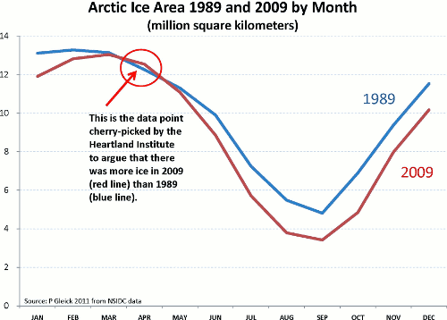
Schmitt’s claim was that the ice area in 2009 (the red line) was greater than in 1989 (the blue line). A glance at the graph shows that this is clearly false.
What Bast has done is pick out a single tiny bit of data (a “cherry”) that, in isolation, could be viewed as supporting Schmitt’s claim. But this obviously nothing but fallacious misdirection.
I present this example because it’s so egregious that it makes the nature of the fallacy plain. But in many cases it might not be immediately clear whether the data in question is cherry-picked or not.
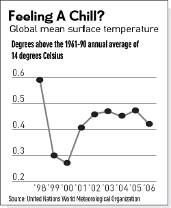 A few years ago it was popular for climate-change deniers to argue that global warming had stopped and that the world was now cooling. One would frequently encounter graphs like the one to the right.
It certainly looks like temperatures are on the way down, doesn’t it? Why, then, should we be concerned with increased CO2? It looks like the alarmism of the climate scientists has been debunked.
But these sort of arguments ignore two important facts:
1) Climate change is a long-term effect. In order to see global warming, you need to look at temperature trends over decades, not over single years.
There will be a good deal of year-to-year variation, but (according to the scientists) over the long run those fluctuations will get higher and higher. We’ll have more high-temperature years, and we’ll break records on the high end, and we’ll have fewer low-temperature years. But nobody expects a steady march of each year being warmer than the last.
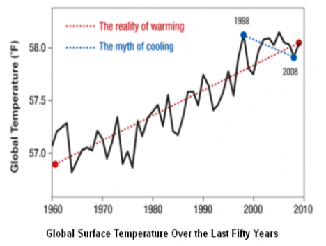
2) 1998 was an unusually warm year. This remarkable spike in temperatures was only partly due to the long-term global-warming trend however. Added to that general trend was an upward spike in the usual year-to-year variation in temperatures, due to a particularly strong El Nino event.
This means that if you you start your graph from this particularly hot year, it will seem that things are cooling down. But really the world is still steadily warming, and you’ve just cherry picked some data to make it seem otherwise. The following graph shows what’s really going on:
—UPDATE—-(4/16/13)—-
It never gets old, aparently. Tamino catches Lawrence Solomon (author of a collection of biographies of deniers) engaging in another world-class case of cherry picking at the Financial Post.
Here’s Tamino’s graph of the two data points Solomon is comparing. The graph is of the anomaly of the sea-ice extent; which means it’s a measure of how much the extent differs from the average extent for that time (I’m assuming, since I don’t see pronounced seasonal periodicity).

Note too that Solomon, like Bast, is cherry picking a date in April for his comparison. A glance at the Arctic Sea Ice Monitor shows that sea ice extent varies very little at this period when the melting is just beginning. This is because things get covered with ice in the winter — global warming isn’t going to change that anytime soon.
The important question is what happens at the end of the melting season. And that’s where we see the frightening drop in ice extent, and the prospect of facing an ice-free arctic some summer in the next couple decades.
No one is suggesting that ice won’t still form in the winter; but that thin new ice is going to melt away in the summer, and that’s going to lead to even more warming (because ice reflects heat, but open ocean absorbs it), and is going to lead to serious environmental problems for the arctic.
(Update 6/2/13: And here’s Lawrence Solomon two months later still making the same argument. To be fair, we are into June now, so the extent is a bit more relevant. But do you think Solomon will be highlighting the extent in September, when it matters?)
Leave a comment