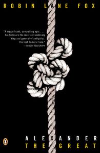
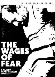
You may not know the name, but you’ll know the work. He creates a feeling for an entire film, distilled down to a tiny rectangular image. The best of his colleagues and the best of the artists of the past have been able to stop you in your tracks as you’ve walked around the video store. Maybe it was Saul Bass’ cover of Vertigo that made you rent it for the first time. Maybe you passed by the DVD of Jules Dassin’s Thieves Highway and needed to know why those apples lay strewn across the road. Eric Skillman has been designing DVD covers for the Criterion Collection for a few years now, and each one is a work of art. Serving as either the primary designer or the art director, Skillman has helped to create some of the most memorable discs to come out in the last few years–including the epic designs for Berlin Alexanderplatz and the upcoming Stagecoach. I’ll let Eric speak for himself below, but make sure to check out his own blog: Cozy Lummox and EricSkillman.com.
-Rob Ribera
All images courtesy of The Criterion Collection and Eric Skillman.
L&S: How did you begin designing the artwork for DVDs?
ES: I was hired to do production work at Criterion, and part of my job was designing “sellsheets” for our discs. Whenever a cover wasn’t ready in time for the announce date, I would mock up a fake cover for the sell sheet, and I tried to make those as good as possible, until I was allowed to design an actual title.
L&S: What was your first design?
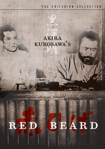
ES: First Criterion design? Akira Kurosawa’s, Red Beard. First design ever? I think it might have been The Cultural Resistance Reader from Verso Books, unless you mean the high school literary magazine, or the dozens of logos I designed for bands I liked in middle and high school.
L&S: What were some of those bands you designed posters for? Any memorable designs?
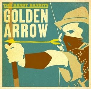
ES: Just friends of mine, mostly: the Randy Bandits, Red Rooster, SOAO (Son of an Oracle), Stumblebum Brass Band, Mr. MacGregor… I was pretty happy with the first Randy Bandits album cover I did for them, “Live from Otto’s Shrunken Head.”
 L&S: Are there limitations or aspects that force you to sometimes change a design? (I’m thinking Downhill Racer as one specific, but I’m sure there are others.)
ES: I don’t think Downhill Racer specifically changed all that much, to be honest… sometimes there are contractual guidelines from studios, generally relating to size and placement of names, titles, and credit blocks, but luckily that’s not too common at Criterion.
L&S: How long is the process? Where do you start and how does it end? Do you watch the movie and use specific images that you think would be perfect to represent the movie, or do you go more for an atmospheric design?
ES: The design process starts with the cover, then moves on to the menus and packaging, and tends to take around four to six months. I always watch the movies, and the specific approach (“atmospheric” vs. image-based) is dictated by the film.
L&S: What are you looking to accomplish with the artwork for a DVD cover?
ES: Ideally, to create a new icon for the film, maybe add a little something to the legacy of the great films I get to work on.
L&S: One interesting aspect of movie advertising is its opportunity to have freedom to create an image that really gets to the heart of the film, like Saul Bass did for countless films. Do you hope to create new images from these films, or do you like working more with established images?
ES: Oh, it’s much more fun to create something new. I’ll use established imagery on occasion–sometimes it would just plain be foolish not to–but those jobs aren’t anywhere near as fun as creating new iconography.
L&S: Do you have more leeway when it comes to the DVD menus? Because Criterion DVDs are always loaded with extras, there are a lot of menus to add in. Do you try to match them to the cover, or go in different directions?
ES: There’s some leeway, although we do always want a set to feel like a coherent whole. The main limitations are technical, actually–the interface has to be controllable via a remote control that only has up, down, left, right, enter to work with, so you have to structure information much more simply than you might on a website or something like that.
L&S: What and who are your influences? Are there some designers you admire, and things you hope to avoid?
ES: Plenty of designers I admire, from Saul Bass to Art Chantry to Rodrigo Corrall to Neil Kellerhouse, and I also take plenty of influence from comics artists, music, film, and really wherever I find it. I suppose one thing I hope to avoid is being bland.
L&S: Neil Kellerhouse is another interesting designer who creates a great mood with simplicity–like his covers for Tin Drum, or the poster he did for The Girlfriend Experience. Have you worked with him over at Criterion?
ES: That Tin Drum cover is amazing, but I wouldn’t exactly call it “simple!” I’ve worked with Neil a lot, actually–on Seven Samurai; The Ice Storm; Paris, Texas; etc etc. He’s great, always full of ideas that I would never come up with on my own.
L&S: Can you talk a little about the difference between designing and art directing?
ES: Designing is the nuts-and-bolts, actually sitting down at the computer (or drawing table or wherever) and making it work. Art directing is about coming up with ideas, usually for others to execute, though of course there’s some overlap between the two.
L&S: Is there a design that you’ve loved, but didn’t get used?
ES: Oh, absolutely… that’s the whole reason I have my blog, to post all my favorite rejects! One favorite example is the “cut paper” cover for An Angel at My Table that was rejected in favor of a simpler photo-based treatment.
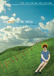 L&S: Was there a specific reason why the cover for Angel was rejected?
ES: Yeah, it was because the producer on that disc didn’t like the underlying concept of placing Janet Frame (the novelist who is the main character in the film) in a “constructed” world, and wanted an earthier and more naturalistic feel.
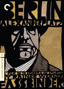
L&S: Can you talk about the task of creating the design and illustrations for Berlin Alexanderplatz? This is a design you created from scratch–how did you decide the tone and content of that design?
ES: Well, the first time I tried to answer that question, it took me two long blog posts to do it here and here, but the short version is that the typography was inspired by some Egon Schiele posters–there’s not a direct connection between Schiele and Fassbinder, but they share some preoccupations and for some reason it made sense to me–and the drawing was done in a style I played around with a lot in college (and have come back to a bit since Berlin).
L&S: One of my favorite art direction jobs you did was for the Monsters and Madmen box set. How did you go about picking the design for each of those covers and the overall tone for those films? Is it more of a challenge to design something so fun while keeping it classy?
ES: To be honest, my main contribution to that set was just having the idea to call Darwyn Cooke; he deserves all the credit for that one. We gave him some concepts (“space ships and submarines: go!”) and asked him to create some imagery in the style of his wonderful covers for his own New Frontier series. As I recall, we didn’t even need more than one or two sketches for any individual cover, he hit all of them right out of the gate. I’m usually a bit more involved as an art director, but sometimes the best thing to do is just find the best person for the job and let them do their thing.
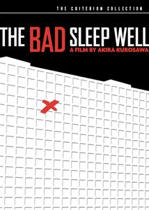
 L&S: Can you talk about The Bad Sleep Well and the balance of minimalism and detail in your work?
ES: I do tend to think the simpler the better, (though that particular design takes it to an extreme). I guess the principle is similar to Scott McCloud’s idea about cartooning, that the more simple the iconography the more universal it becomes. The trick, then, is to boil the film (or book or whatever) down to the simplest icon that is still unique to that film. That’s not a hard and fast rule or anything, I’m really kind of thinking about this for the first time now, but maybe there’s something to it.
L&S: Schiele was amazing at distilling an emotion down into a messy but simple painting or poster–did you catch the show at the Neau Gallery a few years back?
ES: I did not catch that show, but I do like me some Schiele.
L&S: Another great design is for Amarcord. Whose idea was it to make the mural painting? I think it perfectly encapsulates the tone of the film as a dynamic between family/community and self.
ES: The concept was mine, the execution was by the great Caitlin Kuhwald. I agree, she did a great job capturing the manic energy of the film. That’s another one I wrote extensively about on my blog, where you can also see all of Caitlin’s sketches here.
 L&S: And the obligatory question about advice for future designers?
ES: The closest thing I have to advice is this: if you’re doing what I call “interpretive” design (i.e. a cover for someone else’s novel, or film, or album, or whatever), step one should be thinking like an English major–‘what are the major themes, motifs, metaphors, etc?’ THEN move on to thinking like a designer–i.e. ‘how do I make this look pretty?’
L&S: Could you share any of your favorite rejected mockups for covers?
ES: Sure, I’ve attached a few.
3 Comments
James Ramirez posted on March 4, 2010 at 4:27 pm
This guy’s design work is amazing! As a graphic designer/cinephile, working with Criterion is my dream job. Their cover art is always second to none, and people like this are a true inspiration!
isabel Aboim posted on March 5, 2010 at 6:35 am
It really makes a difference. A good cover is always a good start.
pitumbo posted on November 15, 2010 at 2:03 am
Yep, it all starts with the cover!