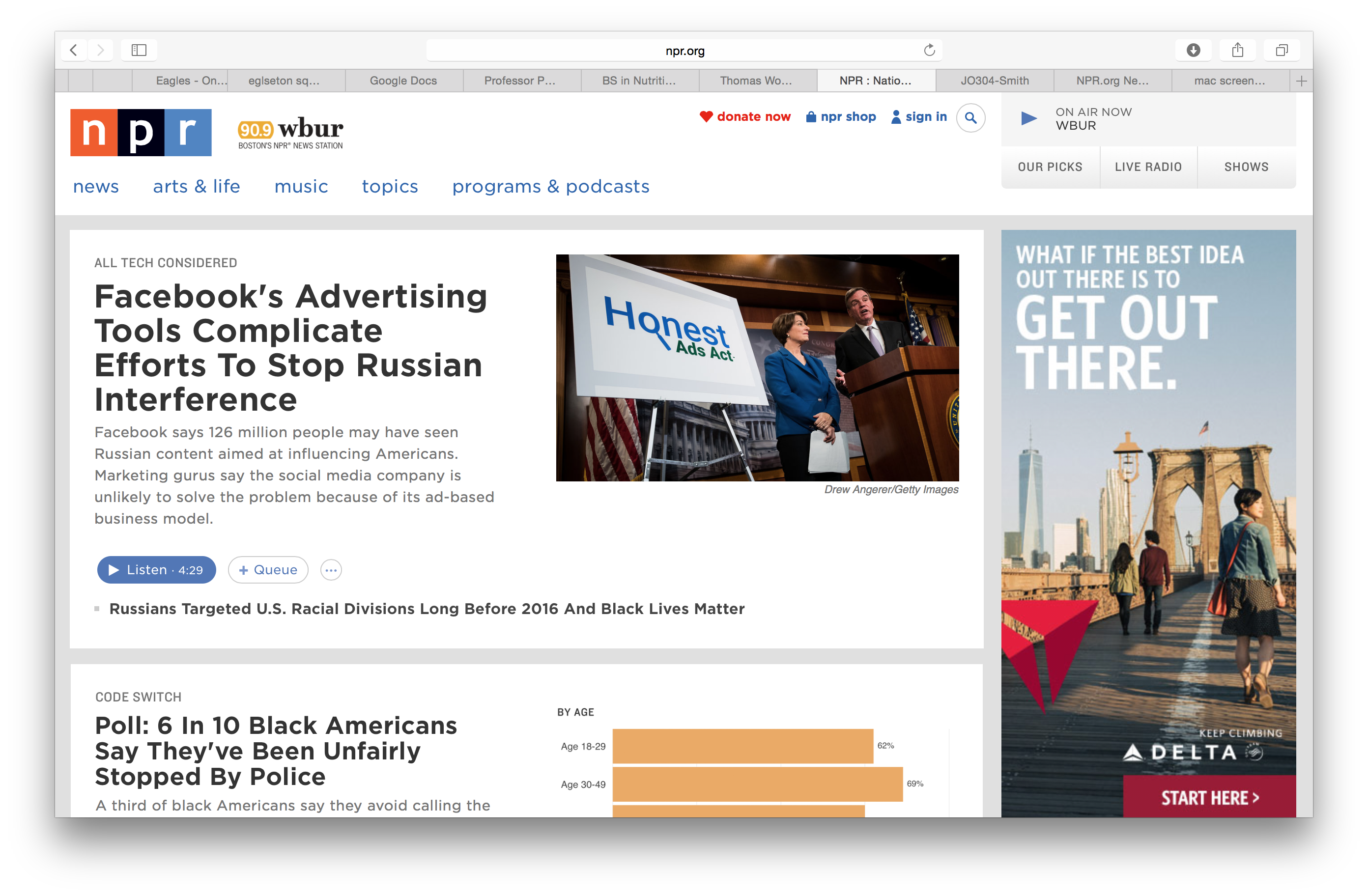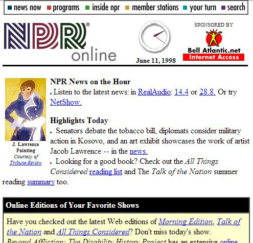
Npr.org, the website for National Public Radio, launched in 1994, follows a simple lay-out design. The top left-corner of the homepage has easily clickable subheads for news, arts and life, music, topics and programs & podcasts; while the top right of the homepage has a livestream available of what’s currently playing On Air. I noticed that the livestream was conveniently set to my local NPR station, WBUR, which is a nice automatic, location-based feature. The homepage itself follows what seems to be a cross-topic aggregation method. For example, at the top of my home-screen tonight (October 30th) was an article about Facebook advertising technology, while the article below it was a poll about police discrimination against black Americans.
The news tab was especially easy-to navigate, as there is even a catalogued “browse by date” section where readers can search for articles throughout the years.

The bottom of every page on the website, in fact, allows the reader to browse the section archive, or just do a general search on topics throughout the website. This is a particularly important research tool for readers, researchers, and journalists that need to find articles from the past that bypass various fields of interest.
Aesthetically, the website is inviting because of its simplicity. The basic “NPR” style-text that is used in the organization’s logo is used for the text throughout the website, and every article is complete with either a picture or graph on top of the article, which makes it easy for readers to better visualize the articles they’re reading.
Additionally, all of the text colors; the pale blues, grays, and blacks, against the white background, makes the website easy on the eyes.
I also appreciated that while there are advertisements on the website (usually on the right-hand side of the website), the Ads were not over-bearing, and a click on an article doesn’t result in pop-ups and separate tabs like some websites have when a reader clicks on an article.